 I heard from my editor about the design idea for the cover of TDD (a.k.a. Tall, Dark, and Dead). She said that they're going with a cartoon -- which would put the audience they're hoping to capture squarely in the chick-lit demographic (works for me!) The image my editor described is of Garnet at the book shop with Barney the cat.
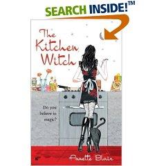
She said the style they're going to try to shoot for is not unlike that for Kitchen Witch by Annette Blair.
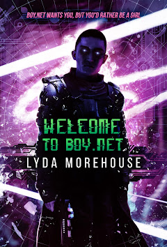
This sort of thing is exactly what I was hoping for. As a reader in the target audience, these kinds of covers have been catching my eye. If you're wondering what input I had into the design, the answer is none. These sorts of decisions (at least in my experience with a large publishing house) are always done in committee. I'm not going to comment as to whether or not I think that's a bad thing, not because I think it is, but because the hows and whys that some books sell well and others don't is a complete mystery to me. I've heard it said by other professionals in the field that they believe their book sold well because "orange" was the hot color to have on a romance cover (this is an exact quote from a colleague of mine in RWA, and she was being dead serious.) And, when people in the field (particularly editors and agents) talk about why the books written by my dear friend Lyda Morehouse didn't sell well, they all bandy about their catch-all phrase "bad packaging." Whatever that means.
I do know that covers sell books. People do judge books by their covers (and their back cover copy!)
I heard from my editor about the design idea for the cover of TDD (a.k.a. Tall, Dark, and Dead). She said that they're going with a cartoon -- which would put the audience they're hoping to capture squarely in the chick-lit demographic (works for me!) The image my editor described is of Garnet at the book shop with Barney the cat.
She said the style they're going to try to shoot for is not unlike that for Kitchen Witch by Annette Blair.
This sort of thing is exactly what I was hoping for. As a reader in the target audience, these kinds of covers have been catching my eye. If you're wondering what input I had into the design, the answer is none. These sorts of decisions (at least in my experience with a large publishing house) are always done in committee. I'm not going to comment as to whether or not I think that's a bad thing, not because I think it is, but because the hows and whys that some books sell well and others don't is a complete mystery to me. I've heard it said by other professionals in the field that they believe their book sold well because "orange" was the hot color to have on a romance cover (this is an exact quote from a colleague of mine in RWA, and she was being dead serious.) And, when people in the field (particularly editors and agents) talk about why the books written by my dear friend Lyda Morehouse didn't sell well, they all bandy about their catch-all phrase "bad packaging." Whatever that means.
I do know that covers sell books. People do judge books by their covers (and their back cover copy!)
Tuesday, August 23, 2005
Cover art
I heard from my editor about the design idea for the cover of TDD (a.k.a. Tall, Dark, and Dead). She said that they're going with a cartoon -- which would put the audience they're hoping to capture squarely in the chick-lit demographic (works for me!) The image my editor described is of Garnet at the book shop with Barney the cat.
She said the style they're going to try to shoot for is not unlike that for Kitchen Witch by Annette Blair.
This sort of thing is exactly what I was hoping for. As a reader in the target audience, these kinds of covers have been catching my eye. If you're wondering what input I had into the design, the answer is none. These sorts of decisions (at least in my experience with a large publishing house) are always done in committee. I'm not going to comment as to whether or not I think that's a bad thing, not because I think it is, but because the hows and whys that some books sell well and others don't is a complete mystery to me. I've heard it said by other professionals in the field that they believe their book sold well because "orange" was the hot color to have on a romance cover (this is an exact quote from a colleague of mine in RWA, and she was being dead serious.) And, when people in the field (particularly editors and agents) talk about why the books written by my dear friend Lyda Morehouse didn't sell well, they all bandy about their catch-all phrase "bad packaging." Whatever that means.
I do know that covers sell books. People do judge books by their covers (and their back cover copy!)
Subscribe to:
Posts (Atom)