Here's the cover for the last in the Garnet Lacey series, HONEYMOON OF THE DEAD.

As I noted yesterday, the publisher decided to go with a whole new look for this book. Let me know what you think!
author of Garnet Lacey (paranomal romance) and the Vampire Princess of Saint Paul (young adult)


Earth's Shadow Series
Welcome to Boy. Net (1) - 2024
Alex Connor Series
Precinct 13 (1)- 2013
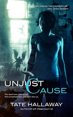
UnJust Cause (2)-2020
Vampire Princess series
Almost to Die For (1) - 2010
Almost Final Curtain (2) - 2011
Almost Everything (3) - 2012
Garnet Lacey series:
Tall, Dark & Dead (1) - 2006
Dead Sexy(2) - 2007
Many Bloody Returns (anthology, contains a Garnet story)
Romancing the Dead(3) - 2008
Dead If I Do(4) - 2009
Honeymoon of the Dead (5) - 2010
----Other Books/Anthologies/Podcasts of Interest
His Magical Pet (e-book) - Anthology
King David and the Spiders of Mars (PB) - Anthology
Breaking Waves (e-book) - Anthology
She Nailed a Stake Through His Head (PB, Kindle) - Anthology
Periphery: Erotic Lebian Futures (PB) - Anthology
Northern Lights: 20 MinnSpec Tales (PB) - Anthology
Whedonistas (PB) - Non-fiction Anthology
By Lyda Morehouse (alter ego)
Archangel Protocol (1) - 2001
Fallen Host (2) - 2002
Messiah Node (3) - 2003
Apocalpyse Array (4) - 2004
Ressurection Code (5) - 2011
12 comments:
It's pretty (I love illustration) but speaks to me more as a Victorian period novel. I don't really get an urban fantasy/paranormal feel from this. Won't keep me from buying it though :)
... I'm trying to think of a non-inflammatory PC way to say how much I dislike the cover ... it's just not coming to me ...
I like the older covers much better, I don't see anything Garnet about it.
I don't like it...I too like the previous covers a LOT better!
Wow, I really don't like this cover. I'll still buy the book, but I don't like it.
Jolene
Tate, I love your books and will continue to read them, but I don't like this cover at all. The original cover art was much better and more reflective of the book. I don't understand why the publisher would decide to change the cover art when they aren't even continuing the series (stoopid publisher on both counts).
I don't think it's bad...it's just not what we're used to, and it doesn't really feel like the Garnet so many of us love. I mean, you should know, Tate, you wrote her - do you really feel Garnet when you look at the cover?
But either way, we've all been taught not to judge a book buy it's cover, so we're all still loyal Garnet followers. :)
I love your books!! And I loved the way the old covers reflected the story and Garnet. This new cover is really eye-pleasing, but not only does it look like it has nothing to do with Garnet, but the woman's arm is totally freakin' me out. One is waaaaayyy to long while the other is normal looking. I don't know if that was the artist's intention, but it just bothers me......But of course this won't stop me from getting the book!!
whoa thats.... really.... no comment
no seriously
I already hate it that I have the first 3 novels from another publisher than the 4th (buying them form germany)
I have the first 3 in this all text/title design and the 4th with the artwork design (I would have prefered keeping buying this one)
so it's not only that I dislike this new cover a lot it also makes the garnet area in my bookshelf look even messier
(though ok I'd still buy it)
greetings from germany^^
I like it however I liked the older covers better.
I like when the covers in a series match, I hate when they change the style - especially with the last book!
however this does not stop me from buying the book, rest assured.
I like the other covers better. And since its the last book in the series I think you should keep it all the same. If it ain't broke don't fix it! :)
Why oh why do publishers keep messing around with book formats - Mary Janice Davidson's Betsy series comes in a different size and print each time a new book is released, Kelley Armstrong has changed cover styles 9 books into a series and 2 books into a trilogy and now this series has gone the same way which is extra annoying as in the UK we had fab covers for the first 3 books, book 4 ok-ish although still not as modern looking as the previous although had no choice as it appears to have been dropped from the UK market and now this book if not already known would most certainly be overlooked as a modern, supernatural romance series and is certainly a book I wont be reading around the pool in public being a guy in my early
20's. I'd let my money do the talking if only they weren't such a damn good read lol. p.s i hope the rumors aren't true that the series is being dropped x
Post a Comment